
Disability Pride Symbol Meaning: Understanding the Colors and Their Powerful Messages
The Hidden Meaning Behind Every Color of the Disability Pride Flag
A flag can catch someone’s eye in a second, but understanding what it stands for takes a little longer. The Disability Pride Flag is a perfect example. Its five muted stripes cross a charcoal background, creating a design that’s striking without being loud. More importantly, this disability pride symbol tells a story about people whose experiences are often overlooked or misunderstood. It represents disability as part of human diversity, not something that automatically needs hiding or fixing. Each color carries its own message, while the complete design brings those different experiences together. There’s much more going on here than a pretty arrangement of stripes.
Start with red, the stripe associated with physical disabilities. It acknowledges people with a wide range of mobility and other physical conditions, whose needs and daily routines can differ enormously. Gold represents neurodivergence, a broad term that includes different ways of thinking, learning, and processing information. Then there’s white, representing non-apparent and undiagnosed disabilities. That’s an especially important reminder: nobody can reliably judge someone’s health or access needs by looking at them. Someone may seem completely comfortable in a crowded room while managing pain, fatigue, or another condition that strangers cannot see. Visibility is not a measure of how real a disability is.
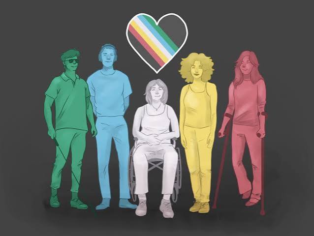
Blue and green complete the colorful band, and their meanings deserve just as much attention. Blue represents emotional and psychiatric disabilities, recognizing experiences that are still too often met with stigma rather than understanding. Green stands for sensory disabilities, including blindness, deafness, and other differences affecting sensory perception. Of course, real lives don’t fit neatly into color-coded categories. A person may identify with several stripes, or describe their disability in a completely different way. That’s part of what makes the flag meaningful. It offers a shared visual language without insisting that everyone has the same story, challenges, or relationship with disability pride.
Even the spaces around the stripes have something to say. The dark background expresses mourning and anger for disabled people harmed by ableism, violence, and neglect. Meanwhile, the diagonal band suggests breaking through barriers that keep people from participating fully in society. The flag also has an interesting design history. Created by Ann Magill in 2019, it originally featured bright zigzag lines. After feedback from people with visually triggered conditions, Magill introduced softer colors and straight stripes in 2021. That change feels especially fitting. Accessibility wasn’t merely a slogan attached to the design; it became part of how the design developed.
Today, the flag can appear at community gatherings, awareness events, workplaces, and online, connecting people who may live thousands of miles apart. Seeing it displayed doesn’t mean every disabled person shares one opinion or identity, and that’s worth remembering. Pride can mean self-acceptance, solidarity, resistance to discrimination, or simply being able to participate without having to explain yourself constantly. Used thoughtfully, the disability pride symbol can open conversations about practical inclusion, from accessible buildings to respectful language and equal opportunities. Knowing what its colors represent is a good beginning. Listening to disabled people, and acting on what they say, is what gives that understanding real value.
…
Read More